Google Contacts Introduces New UI and Home Screen Messages Widget
Google Contacts update with a revamped UI and home screen messages widget. improve user experience and streamline communication on Android devices.

Google Contacts: A Glimpse into Its Future and New Messaging Widget
Google Contacts, an essential app for Android users, especially those wielding Google's Pixel devices, is poised for a significant update. This revamp promises to enhance the way users organize and interact with their contact lists, a core service since its 2007 debut alongside Gmail. With version 4.26 on the horizon, users can anticipate not just routine bug fixes but also exciting UI enhancements and a novel messages widget, all aimed at enriching the user experience.
Introduction to Google Contacts' Evolution
Since its inception, Google Contacts has been the cornerstone of contact management for Gmail and Android users. It's evolved from a simple list organizer to a sophisticated tool integral to the Android ecosystem. This evolution reflects Google's commitment to refining user interfaces across its software suite, with Contacts being the latest beneficiary.
Upcoming Enhancements in Google Contacts
The transition to version 4.26 marks a pivotal update. While it encompasses general improvements, the real intrigue lies in the enhancements hidden behind flags, as revealed by the diligent exploration of AssembleDebug from TheSpAndroid.
Behind the Scenes: Hidden UI Enhancements
AssembleDebug's activation of hidden flags unveils a UI transformation aimed at streamlining navigation and interaction. This includes a filter icon for toggling navigational chips and a revamped approach to selecting contacts, moving away from the traditional sidebar and hamburger icon.
Navigational Changes and Their Impacts
The introduction of a filter icon signifies a shift towards a more intuitive user interface, allowing for quick access to contacts based on phone, email, or company. This change simplifies the user journey, eliminating the need for the now-obsolete sidebar and hamburger icon.
New Features for a Streamlined Experience
A notable addition is the "plus" icon in the search bar, facilitating the swift addition of new contacts. This feature complements the existing floating action button, exemplifying Google's effort to enhance user efficiency.
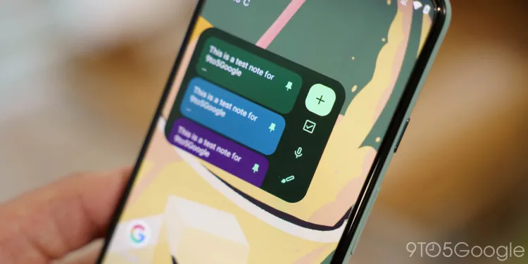
Introducing the New Messages Widget
The forthcoming messages widget represents a significant leap forward in accessibility. It enables users to pin messages from a specific contact directly to their home screen, streamlining communication with essential contacts. For more insights, visit Kiksee Magazine.
Comparison with Previous Widgets
This widget builds on the foundation of a previous update, maintaining continuity while introducing innovative functionalities that emphasize quick access and personalization.
Customization Options and User Experience
December saw Google working on custom ringtones, further personalizing the user experience. These features, along with the UI redesign, although not as extensive as Google Maps' overhaul, mark significant strides in user interface enhancement.
Google Contacts and the Broader Google Ecosystem
Google Contacts doesn't operate in isolation; its integration with services like Google Maps underscores its role in the broader Google ecosystem, facilitating seamless user connectivity and interaction.
Future Outlook and Expected Rollouts
While the public rollout of these features remains under wraps, the anticipation builds. Google Contacts' evolution is a testament to Google's commitment to innovation and user satisfaction.
Conclusion: The Evolving Landscape of Google Contacts
As Google Contacts strides into the future, its upcoming update heralds a new era of contact management. With enhanced UI features and the introduction of a messages widget, Google redefines how we connect, communicate, and navigate our social and professional circles.
For more details on how to leverage these updates for a better user experience, stay tuned to Kiksee Magazine.
FAQs
How does the new messages widget enhance user experience?
What are the key features of Google Contacts version 4.26?
How do the UI changes affect navigation within the app?
Can I customize the new messages widget with any contact?
What implications do these updates have for future Google Contacts versions?
How does Google Contacts integrate with other Google services?
What's Your Reaction?


